Opdoffer: making offers simpler to create, send and sign
Opdoffer makes creating a professional offer less of a chore: get the branding in place, build the offer with AI and send it as a live page rather than a static PDF. From there the sender can see when it was opened, which parts were read and when it was signed, instead of sending it off and hearing nothing.
1. From an internal tool to a product
Working at an agency, every new project starts the same way - by creating a tailored offer. To avoid the regular reworks of PDFs and single page offers, I built an AI-powered tool to turn proposal context into responsive, on-brand offers.
Colleagues adopted it, and clients started asking to use it themselves. That sparked the idea for Opdoffer.
Opdoffer brings the entire offer process together. Users can create branded offers with reusable content blocks and AI-assisted editing, then send them as interactive pages instead of static PDFs. They can track client engagement, let clients choose options or packages and collect legally binding electronic signatures.
2. The product and my role
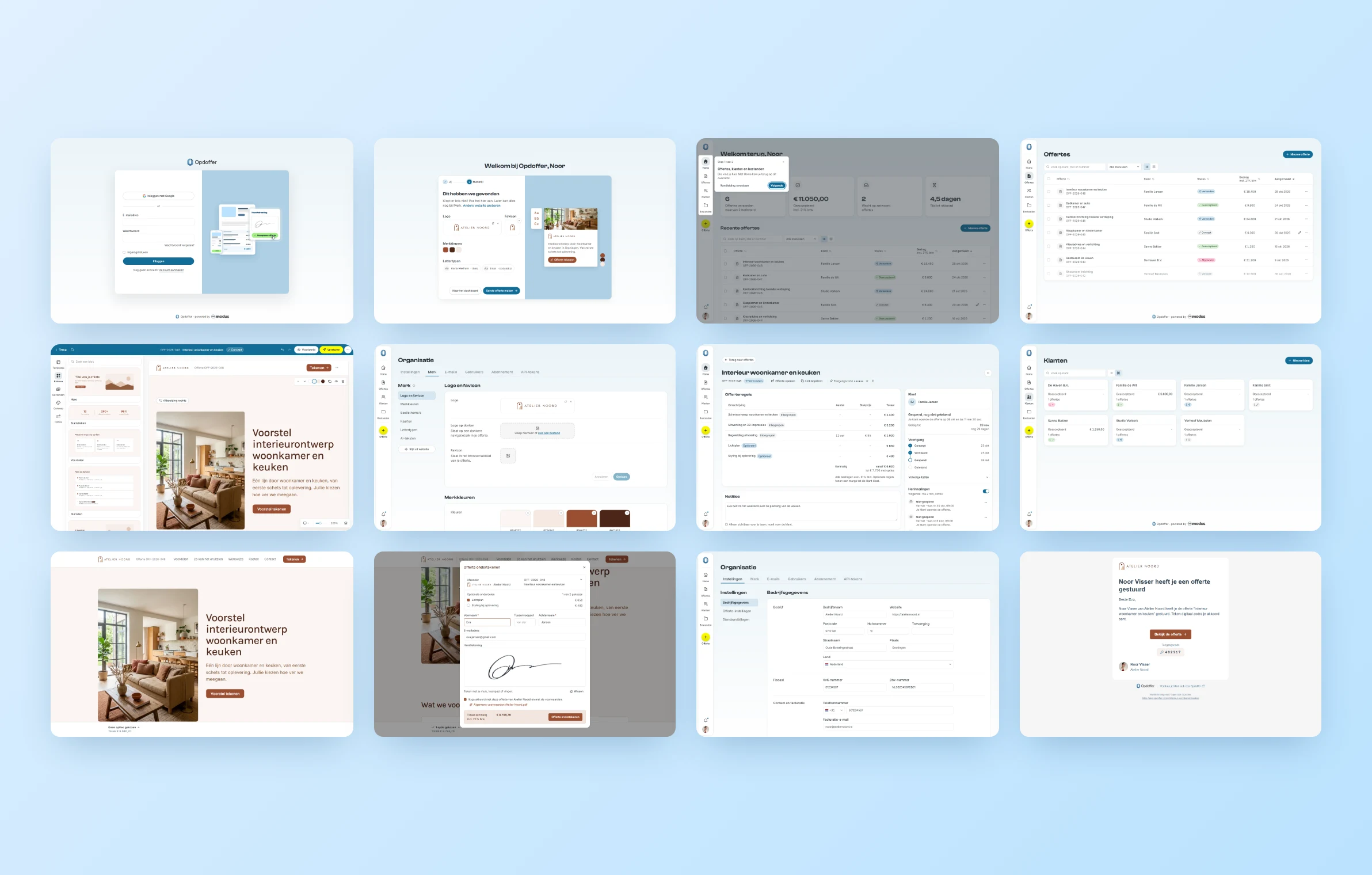
Opdoffer has three main surfaces, each with a different job.
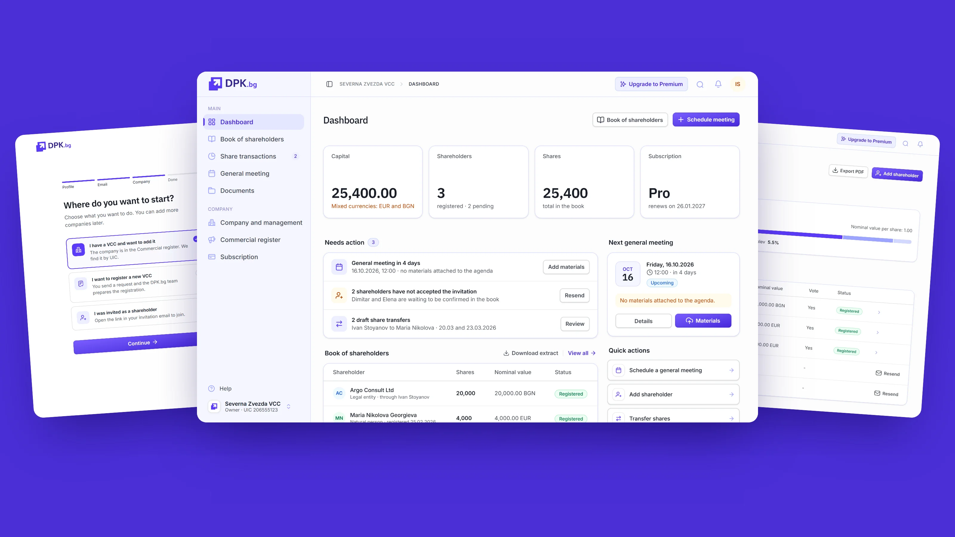
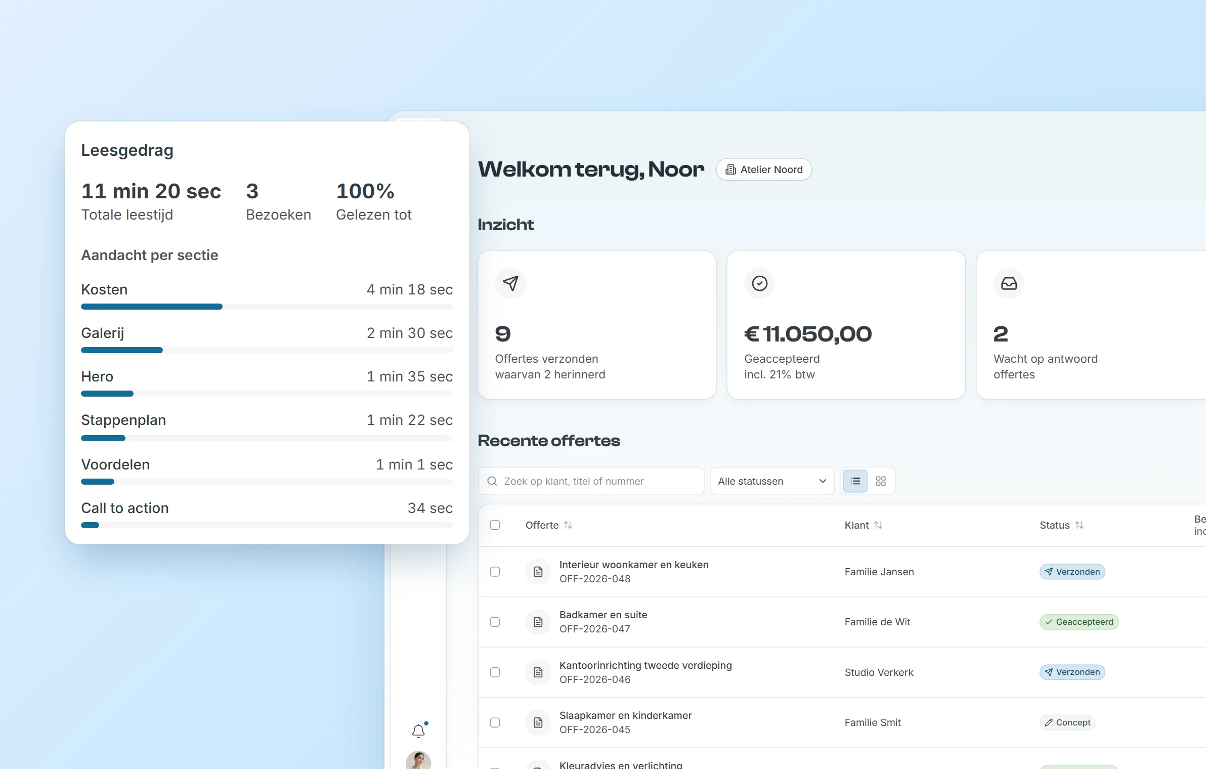
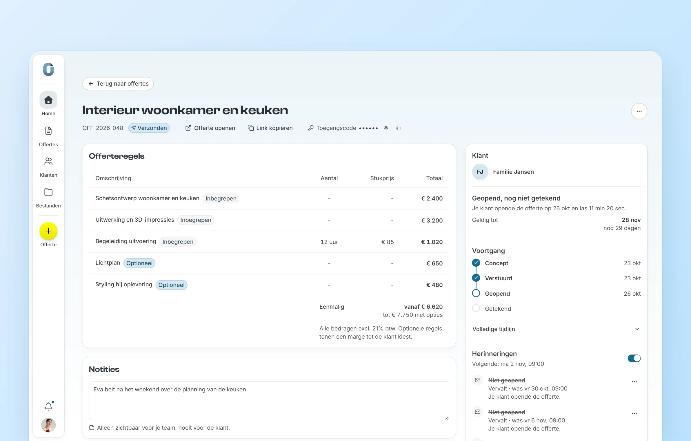
- The dashboard gives the sender an overview of their clients, offers, statuses and follow-ups. Each offer has its own detail page with its timeline, reminders and reading activity.
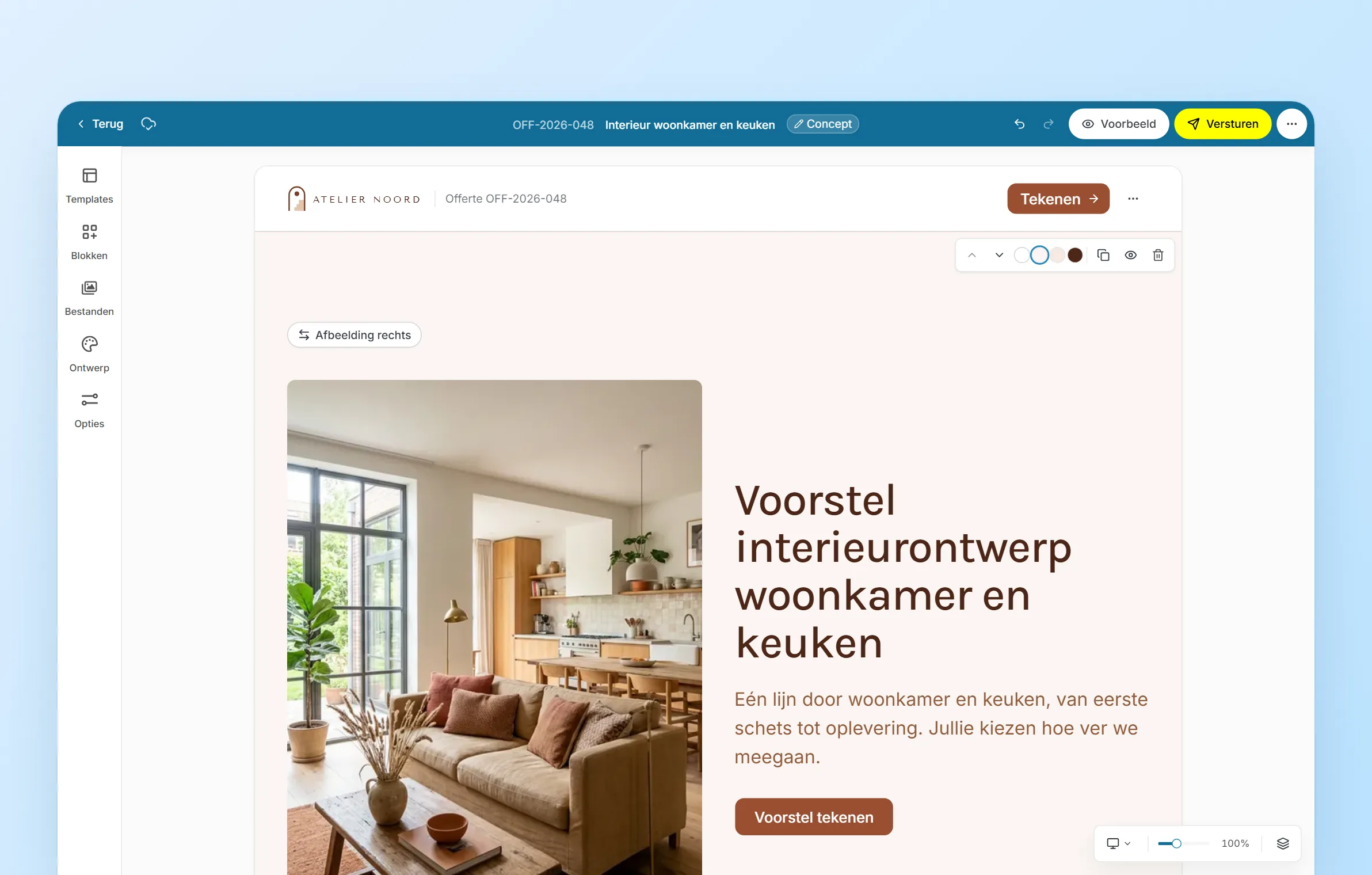
- The editor is where the offer is made. Users can generate their offer fully with AI, start from a template or even build it block-by-block for full control. They can edit the content directly and preview it across screen sizes, set their custom settings per offer, and publish and send it to their client.
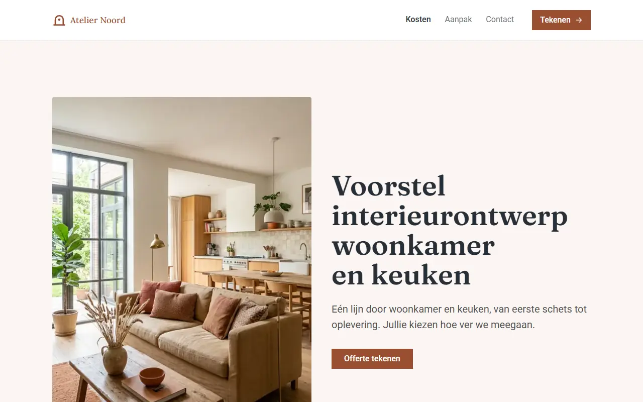
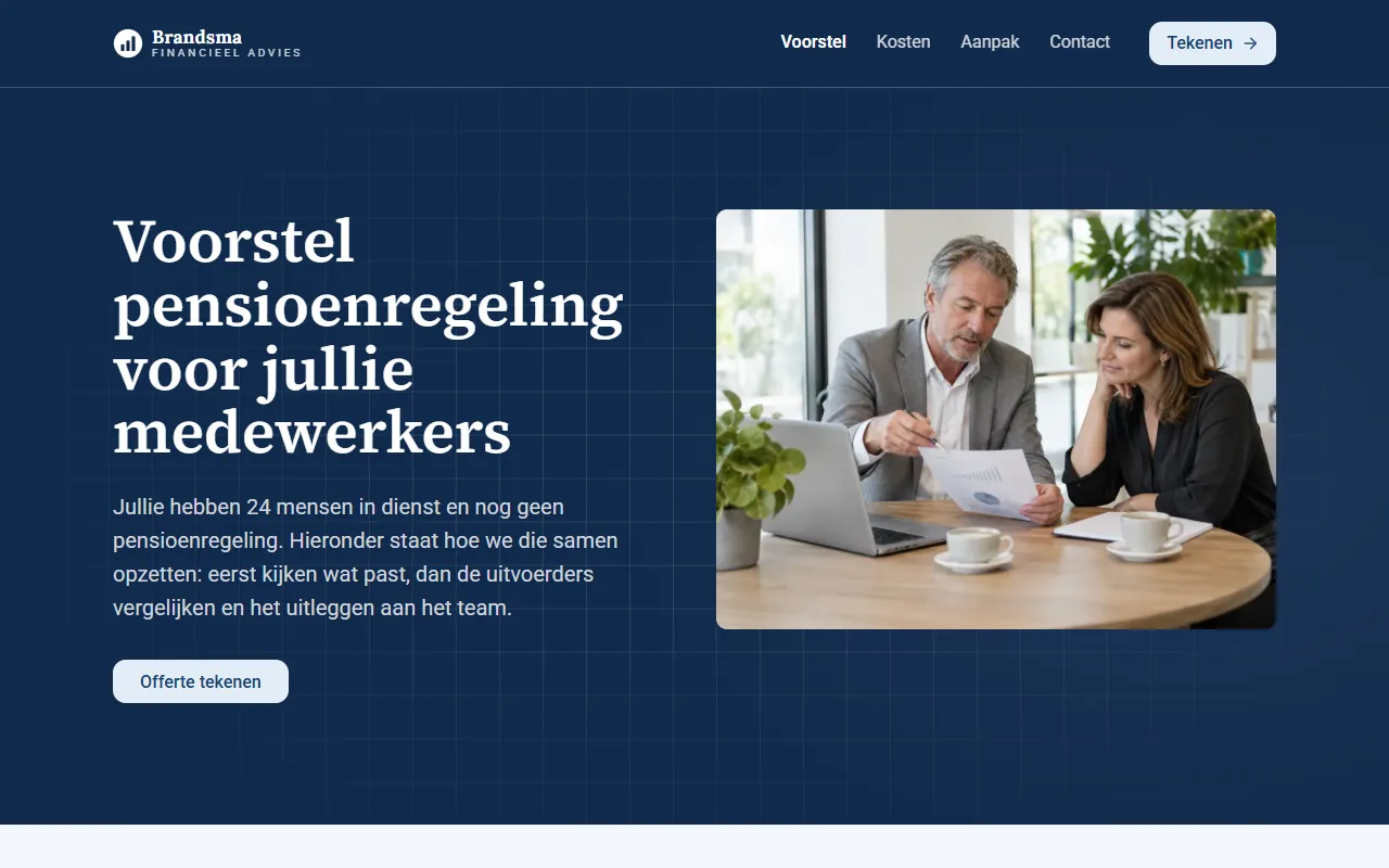
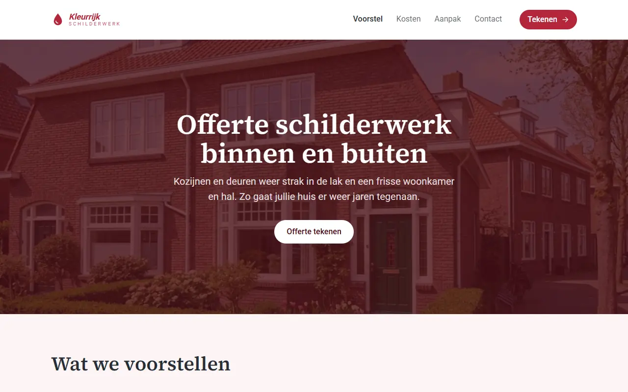
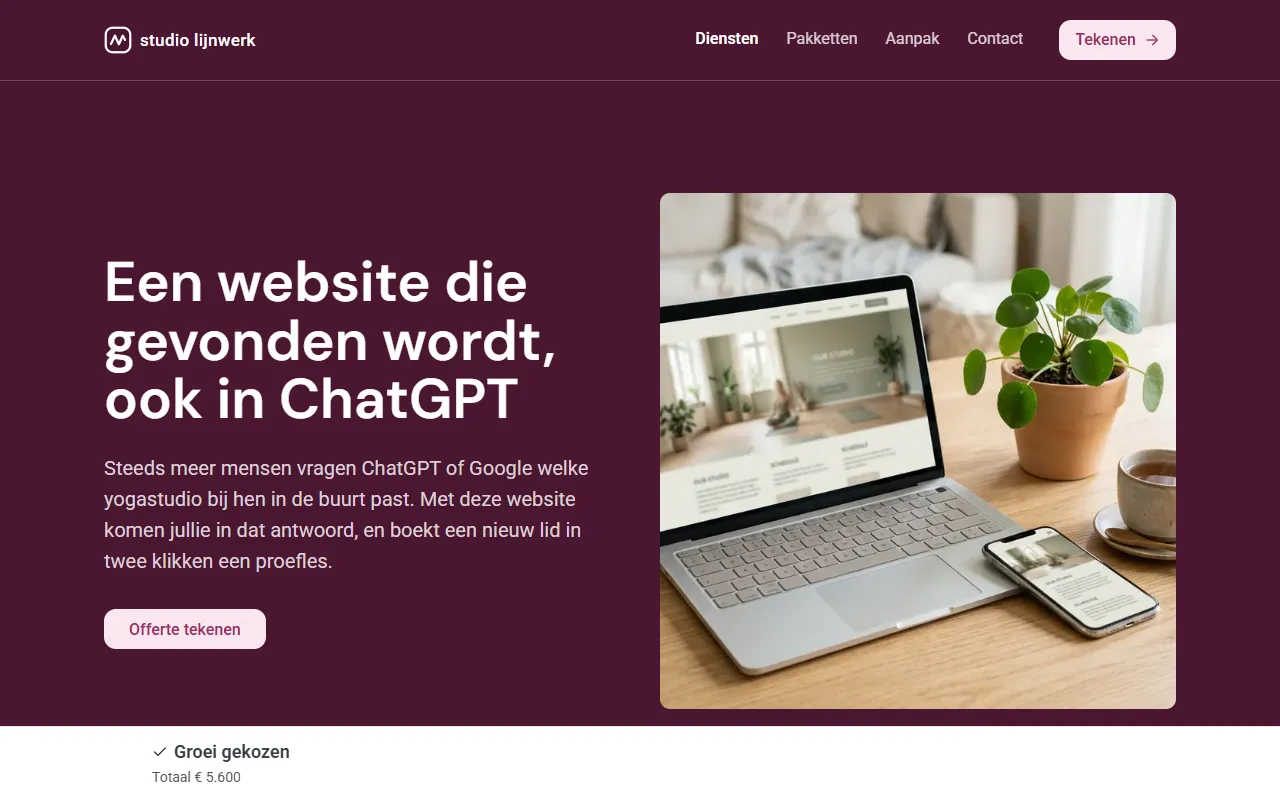
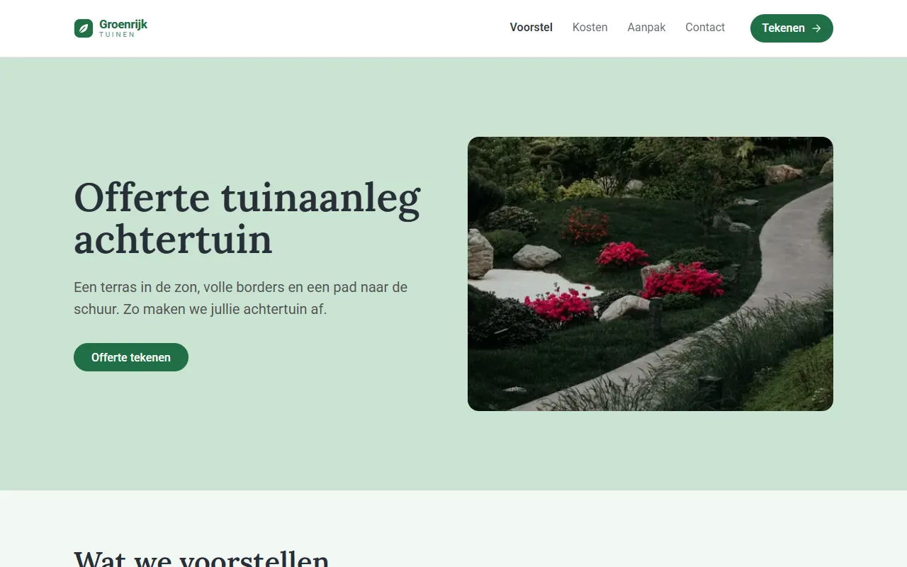
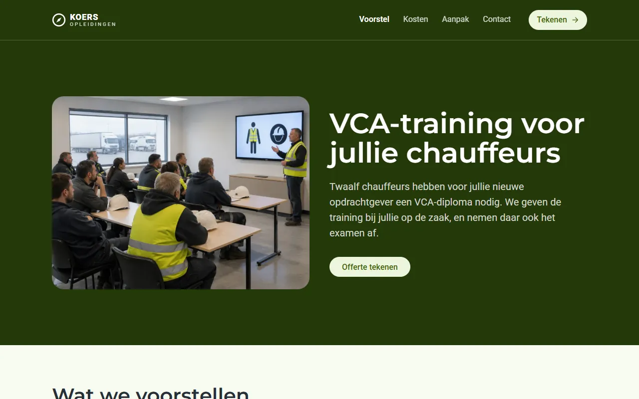
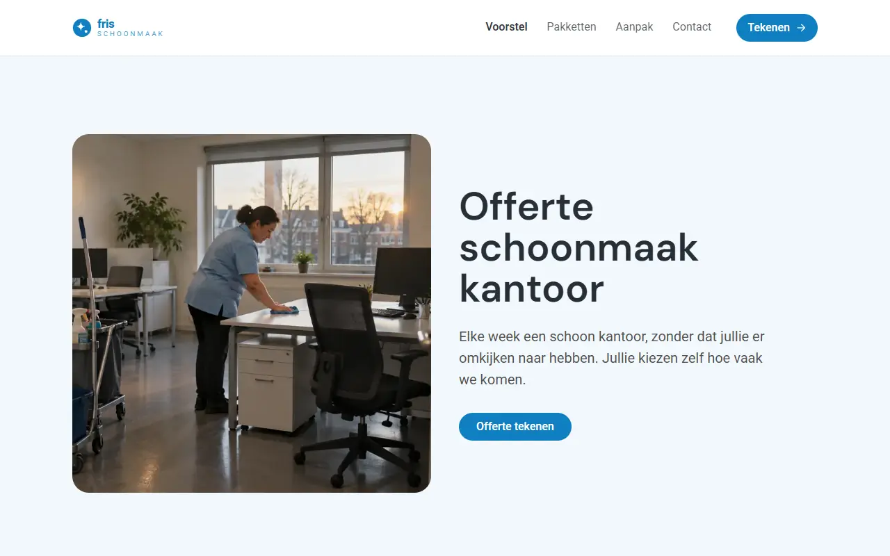
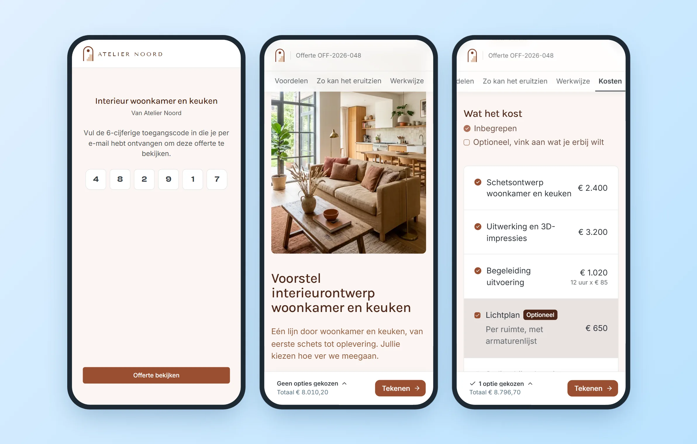
- The public offer is what the client receives. It’s a branded web page behind a six-digit access code, where the client can review the offer, choose services or a package, and sign without creating an account.
In this project my role went beyond a traditional UI/UX designer’s role. It started with the research and the information architecture, then the user flows and the rounds of iteration on them, the testing with controlled user groups, the logic behind the brand extraction and the entry points and behaviour of the AI. Right up to building the full front-end with Claude Code.
Improvement and feature expansion are a continuous cycle, with dedicated work based on what comes out of the feedback and the testing sessions. We release every two weeks, which means a major addition can be in the product very soon after someone has asked for it.
3. Turning a website into a usable brand
The brand extractor had to do more than scrape colours and fonts. It needed to understand a website’s visual identity: which colours matter, how they work together and what makes the brand recognisable, then turn that into a simpler system for offers.
The first versions already filtered out some styles, but too many similar shades still made it into the brand guide. With each iteration and each different website framework I tested, I improved the logic. The goal was to make it easy for anyone to create an offer that looks like their business.
From raw colours to a smaller system
The primary and secondary colours take priority, while minor variations and neutral colours are treated separately. Instead of a list of everything found on the website, users get a smaller set of colours they can confidently use throughout an offer.
The same thinking applies to fonts, logos, favicons, corner radius and colour combinations across sections, which become themes in the editor. The extractor also checks colour contrast and adjusts text or button colours where needed. While the visual identity comes from the website’s HTML and CSS, AI helps bring the written side of the brand into the offer, from company descriptions and tone of voice to services and FAQs.
4. Less choice, more flexibility
Different businesses need different kinds of offers. A software company might need cost breakdowns and figures, while a marketing agency needs service packages and an interior design studio relies more on photography and project timelines.
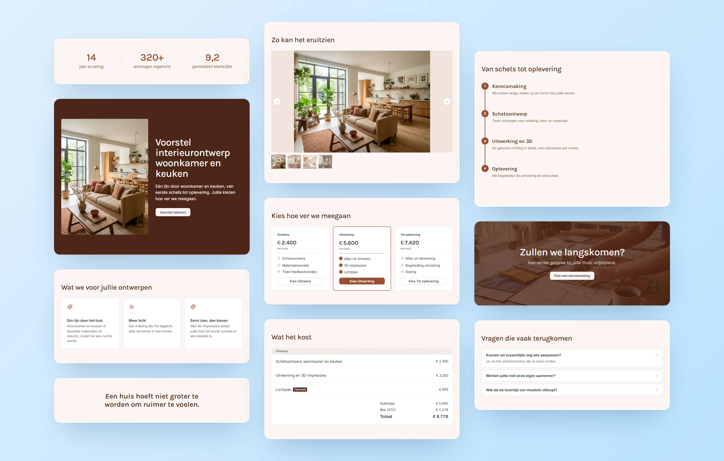
Based on different offers, user needs and feedback from our first clients, we shaped the editor around 16 block types. Pricing gets two separate blocks: Kosten for flexible cost tables and Pakketten for tiered service packages.
Each block has a specific purpose and relevant options, without creating a separate block for every possible layout. Users can still edit text, move and duplicate sections, change themes, add files and use AI to revise content.
The goal was to give businesses enough flexibility to create offers that fit their needs, without overwhelming them with design decisions.
5. AI that helps without taking over
AI supports different parts of the offer process, from generating a first draft from a brief to rewriting individual fields, sections or the entire offer. It also helps create written brand content from a website.
Rather than relying on one prompt box, users can choose what they want AI to work on. They can request a small wording change or a broader rewrite without regenerating everything. AI proposes the changes, and users decide whether to keep or revert them.
That control matters because an offer is meant for a real client. In an early test, generated content included information from the internal brief that wasn’t meant to be shared. We introduced a shared writing rule to keep the brief as source information and the offer as a message from the sender to the client. This applies across all AI entry points.
Behind the scenes, output is validated against the editor’s expected structure, requests and costs are logged, and the system can fall back from OpenAI to Gemini if needed.
For now, AI works with existing sections rather than deciding to add or remove them. This keeps structural decisions in the user’s hands.
6. An offer needs to be trustworthy, not just good-looking
The editor is only one side of the experience. Once an offer reaches a client, the information needs to be clear, choices easy to understand and the agreement reliable.
Together with the product manager, we looked at existing signing solutions and explored what could be simplified. Clients shouldn’t need an account, learn a new platform or go through unnecessary steps just to respond to an offer.
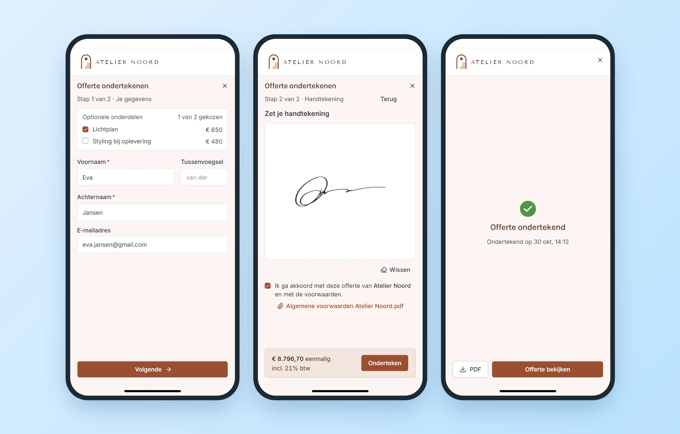
They open the link, enter a six-digit access code, review the offer and select any optional services or package. Their choices and total remain visible throughout the process. Before signing, a dialog brings together the selected options, pricing, VAT and relevant terms. The experience is also adapted for mobile, with a full-screen signing flow and a signature pad that works in landscape orientation.
But simplicity alone wasn’t enough. The more important decision was what happens when an offer is published.
Locking the offer
Once an offer is signed during publishing, it becomes locked. Any changes afterwards require a new draft.
This was a deliberate choice to protect both parties. An offer should remain exactly as it was when it was presented and agreed to. Neither side should have to wonder whether the content, pricing or selected options changed afterwards.
Locked once sent, so what the client sees never changes underneath them. To make a change:
The signing process preserves that agreement in a record of what was presented and accepted, including the client’s details, timestamp and chosen options. A sealed PDF is generated from that signed version.
The current implementation uses a simple electronic signature with an audit trail, without identity verification or a certificate-signed PDF.
The sender can also track when the offer was first opened, how much time was spent on each section, and whether attachments were opened or downloaded. Reminders can be scheduled automatically or sent manually. That gives the sender a way to follow up without relying entirely on guesswork.
The result is one connected flow: make the offer, send it, see what happens, and keep a record of the agreement.
7. Keeping the design system consistent while building quickly
Opdoffer combines two visual systems. The dashboard, editor and navigation follow Opdoffer’s own design system, while the offer itself takes on the customer’s branding through its colours, typography, cards and buttons.
I built the front-end with Claude Code, which helped me move quickly but also introduced the risk of hardcoded values and inconsistent styling.
To prevent that, I added a custom ESLint plugin to catch design system violations,
alongside a CLAUDE.md file with coding rules and a mistakes log. When an
error exposed a gap in the rules, I added checks to make the same mistake harder to
repeat.
The goal wasn’t to slow down development, but to make sure speed didn’t come at the expense of consistency.
Research / iterate: failed concepts in testing and UX feedback after launch both loop back to Build.
On that loop, code slips become new rules in CLAUDE.md + ESLint, so the next build is tighter.
8. Testing the product with real users
Before launch, we ran moderated sessions with ten participants at the INC event. They tested the brand extraction, generated an offer and signed it on a phone while talking through their experience.
The sessions helped us identify gaps in the real workflow. For example, clients needed access to terms and conditions and product sheets directly from the offer, with relevant terms acknowledged during signing. This led to improvements in attachments and terms confirmation, shipped in the next release.
The feedback didn’t stop at launch. It became part of the ongoing improvements to the onboarding, editor and signing experience.
9. What I took from building Opdoffer
The most interesting part of Opdoffer wasn’t any single feature, but deciding how much complexity to keep behind the scenes.
The brand extractor turns a website’s visual identity into a usable system. The editor offers enough blocks without overwhelming users with choices. AI helps improve content without taking over, and the signing flow makes sure an agreement remains clear and reliable.
Building Opdoffer gave me the opportunity to work across product design, UX architecture, design systems and front-end development, while exploring the boundaries of what current AI tools can do.