Making legal tech usable
Overview
DPK.bg is Bulgaria's first platform for managing Variable Capital Companies (VCCs), a new business structure designed for startups and investors. I redesigned the marketing website to make a complex legal product understandable to non-lawyers, then redesigned the platform behind it.
The challenge
Starting from zero awareness
A Variable Capital Company is a new business structure in Bulgaria. It combines the flexibility of an LLC with benefits designed for startups and investors: low capital requirements, share transfers without a notary, fully digital company setup. For the legal world in Bulgaria, this is the biggest change to company formation in more than 20 years. Only lawyers and accountants knew about it, and only a fraction of them.
Asking for the sale too early
The original site went straight to the sale. Pricing tiers, features, calls to action. For a product people already knew, that could have worked. For a brand new legal entity and a platform built on top of it, it was the wrong starting point.
Users dropping off
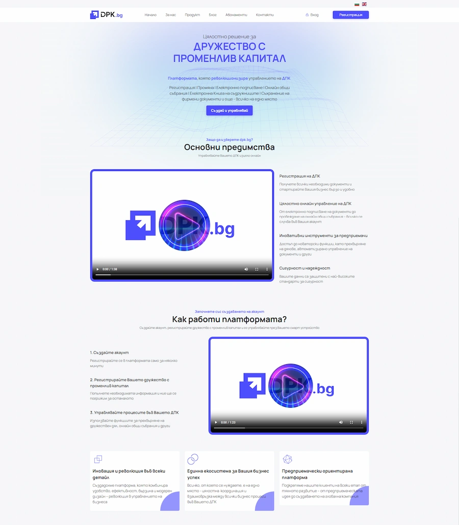
The homepage opened with features for a product visitors didn't recognize. Pricing had four separate packages with overlapping, inconsistent features that made the choice harder than it needed to be. Users would sign up for the free demo, end up in a complicated platform without an onboarding flow or a clear first step, get confused and leave.
Two main tasks
The work fell into two tasks:
- Position the VCC as a credible choice - both for starting a new company and for converting an existing one.
- Make the platform usable with onboarding, simplified navigation and design consistency.
phase 1
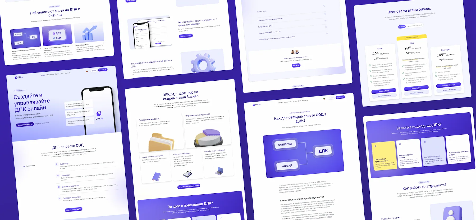
Website redesign
Turn VCCs from a legal concept no one had heard of into a product people sign up for.
Key decisions
Educate before selling
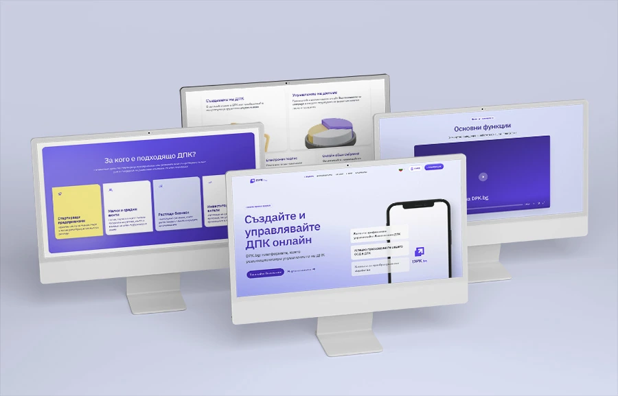
The old homepage was thin. A few sections on the platform's features, two-minute demo videos showing how to use the product, and that was it. Nothing about what a VCC was, nothing about who the platform was for. User sessions bounced fast. People who hadn't heard of a VCC had no reason to sit through a feature walkthrough built for users who already had an account. Sales calls confirmed it: the first ten minutes were always spent explaining VCCs before anyone could talk about the platform.
The problem: nobody knew what a VCC was. You can't sell a management platform for something nobody's heard of.
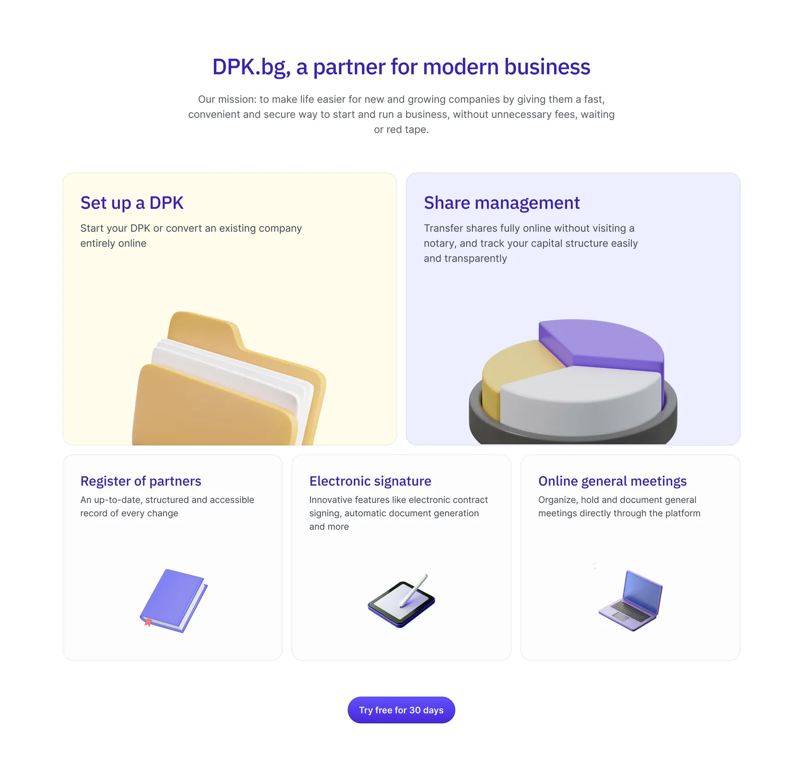
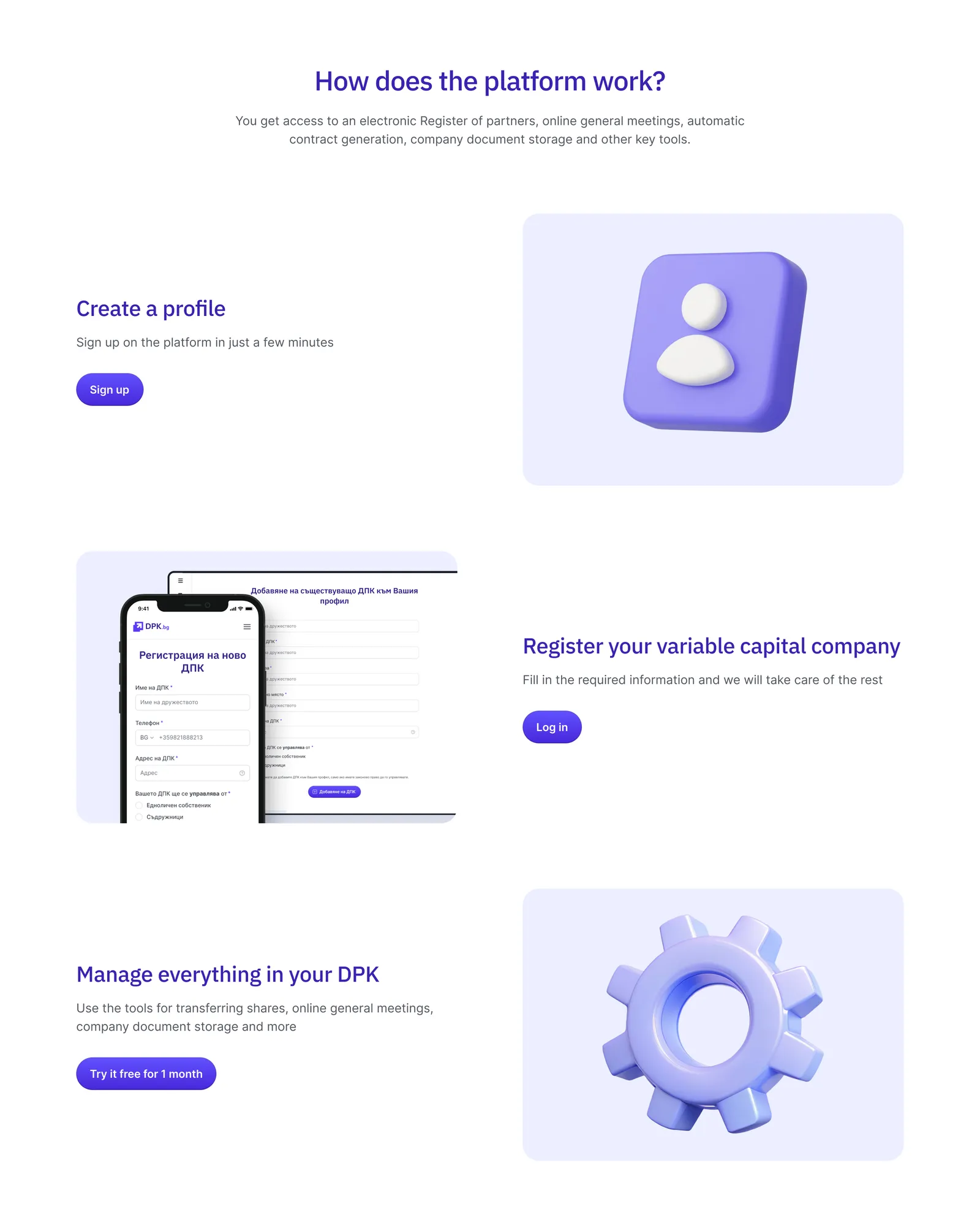
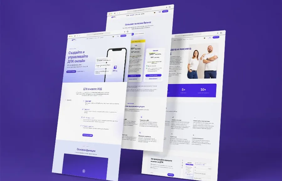
So the new homepage starts earlier. What is a VCC. Who's it for. What do you actually get. How to start in three steps. The whole page is one scroll from "what's this" to "this is exactly what my business needs."
Three pricing tiers for three buyers
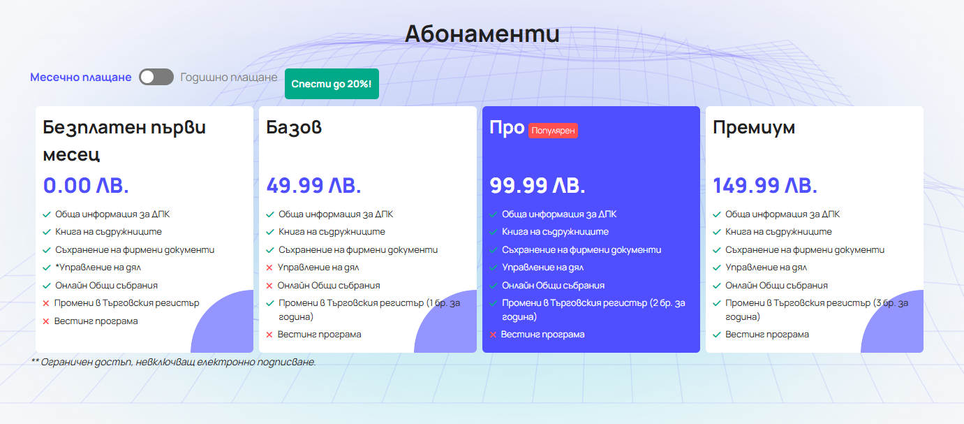
The old packages were sorted by feature count. Four tiers, inconsistent across each other, and nothing about who any of them were for.
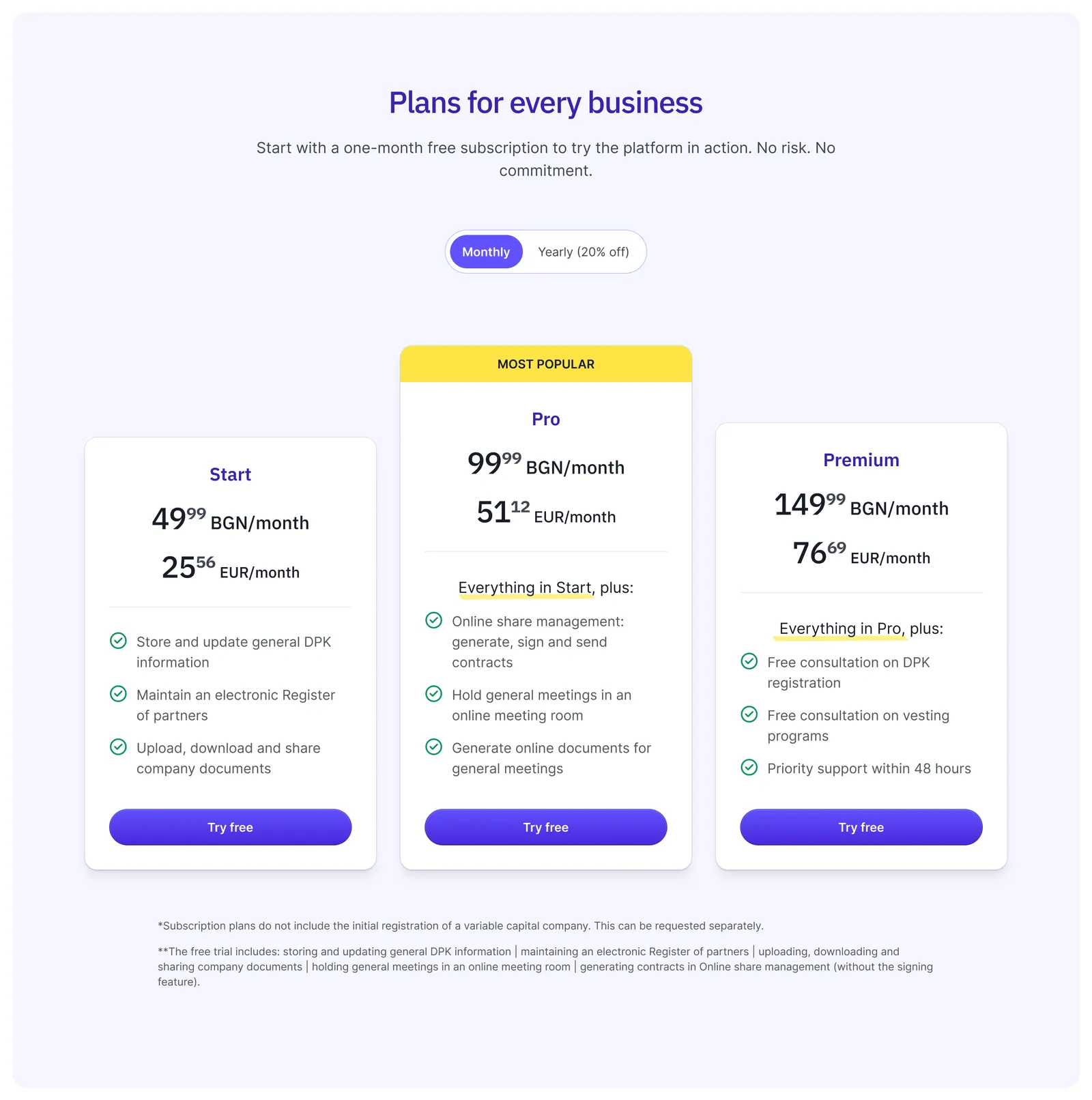
The new pricing is three tiers: Start, Pro, Premium. Each one builds on the previous, so the choice is no longer "which features do I want" but "how much paperwork I want done for me?" Pro is marked as most preferred to guide the typical buyer there, while Start and Premium anchor the ends.
The three buyers came out of conversations with the founding team about who was actually signing up, and which conversations were closing.
The startup founder with a limited budget takes Start. The mid-market owner with multiple shareholders and managers, who needs active management, lands on Pro. The premium client who wants to hand off the legal admin entirely and have someone on call takes Premium.
Content as product
The homepage was enough to introduce the concept. But a completely new legal form, with all its complexity, needed more than a quick read.
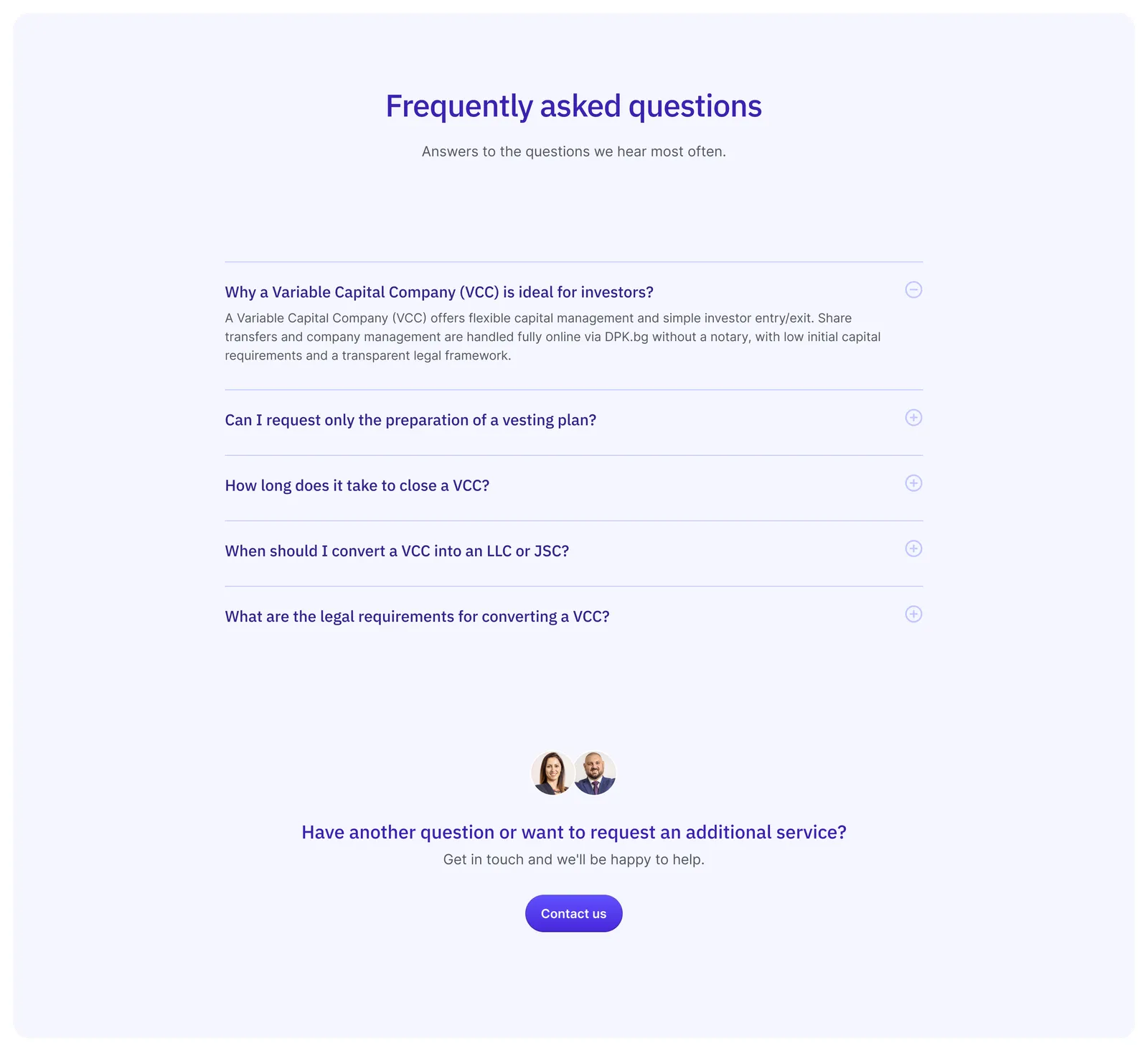
I built a layered education system. A blog with proper explanations of how VCCs work in practice, use cases, comparisons with other company forms, and articles written for each user type. A dedicated FAQ page built from the questions users had been asking through the old contact form, repeatedly. And segmented email sequences that meet people where they are in the journey: still learning what a VCC is, comparing it to an LLC, ready to sign up but stuck on a specific question.
The content didn't just live on the site - it worked for it. The dev team and I pushed the SEO score to 100 on Lighthouse, so the same articles that educated existing visitors also pulled new ones in through search.
Results
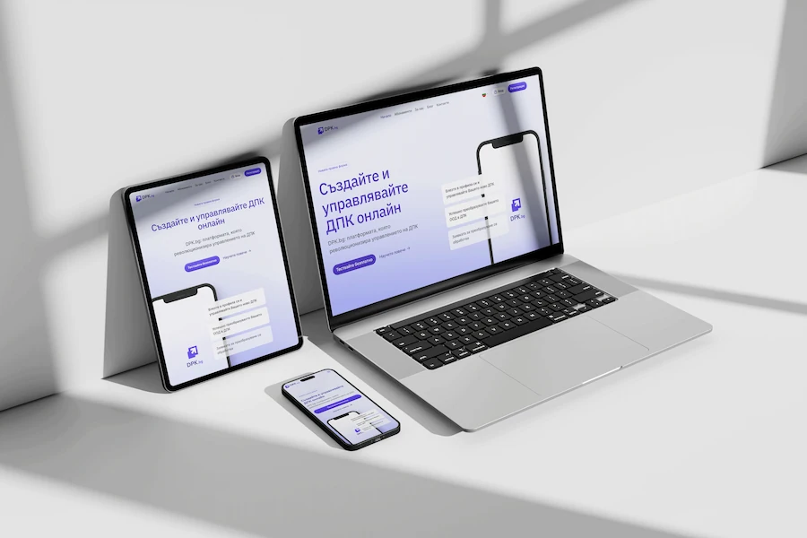
The redesign turned a niche Bulgarian site into a product foreign companies could find, understand and sign up for. English opened the door. The educational content kept it open and brought new visitors in through search.
The first paying clients ever signed up. Then foreign companies, which the Bulgarian-only version had no chance of reaching. The platform also picked up its first real partnerships, including Paysera and several startup ecosystem partners.
phase 2
Platform redesign
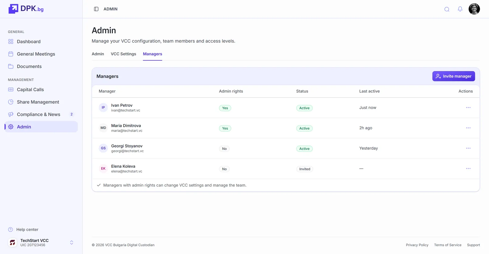
With the website converting, attention shifted to the product itself. Each VCC has an admin (usually the company owner) who manages the account and assigns access to other users like shareholders, accountants or co-managers. Some users belong to more than one company, usually managers or bigger investors. The platform had to handle that, and the original version didn't: confusing to navigate, hard for a new user to get started in.
DPK.bg is a small team with engineering bandwidth split across legal compliance, platform features and customer support. The platform redesign had to land within that constraint: no custom design system, no months-long component library build, no patterns that would slow the team down to maintain.
Key decisions
Built on Untitled UI
The platform sits on Untitled UI. Tokens, components, accessibility patterns built in. For a startup with a small team and a long product roadmap, that's the easiest place to start: every state is already designed, the system is documented well enough that adding new panels or flows doesn't require inventing them from scratch, and the same library is maintained in Figma and React so the design and dev sides stay in sync.
Components that already had every state covered meant fewer empty-state and edge-case gaps for new users to fall into. That mattered more for this product than for most. A confused user in a legal-tech platform doesn't just leave, they call the founders.
Even on projects that don't use Untitled UI directly, my tokens and variables tend to follow the same approach. It's the system shape I most often borrow from.
Clearer navigation
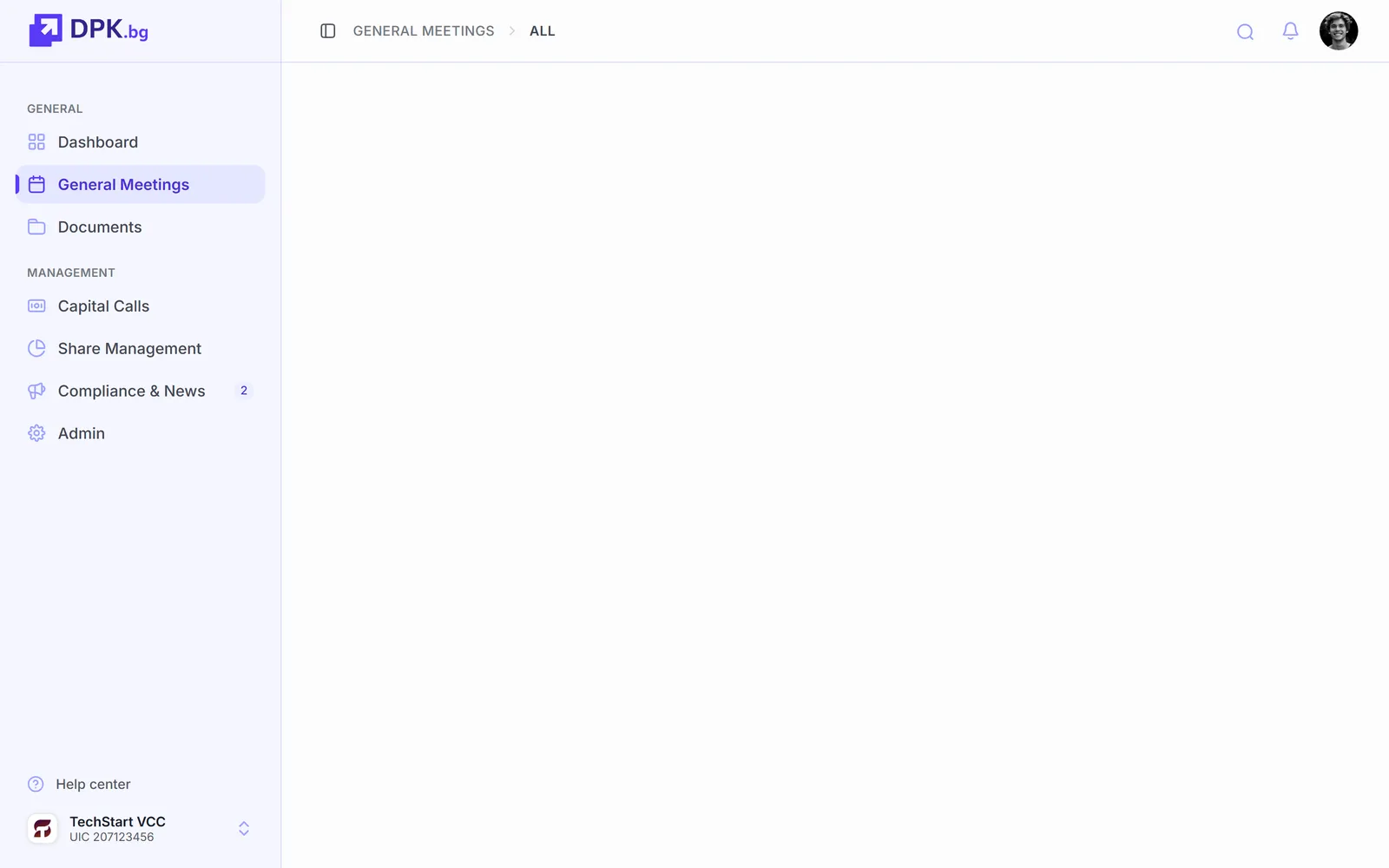
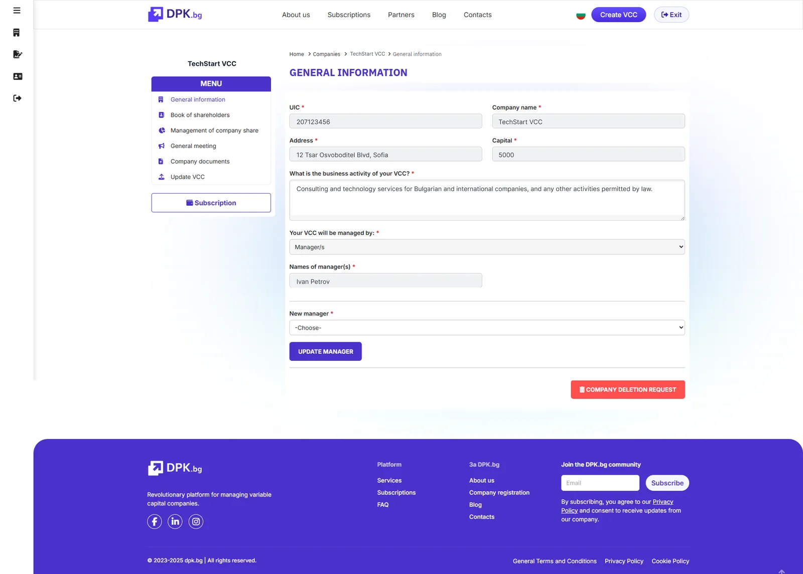
The biggest problem on the platform was getting around it. Switching between companies was through a specific page and the active company wasn't visible at all times. The sidebar was unclear about where the user was. And the marketing site's navbar and footer were still there after login, so the product felt like a logged-in version of the homepage instead of its own product. The founders flagged it as the most common support question from users with multiple companies on their account.
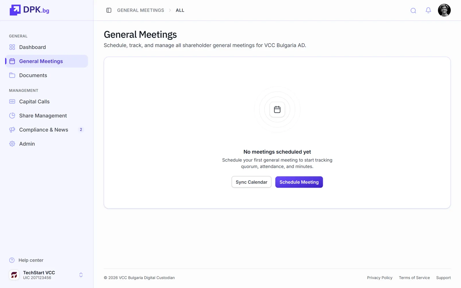
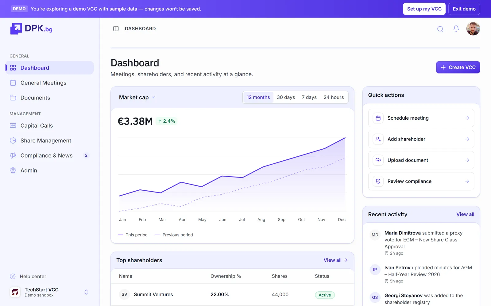
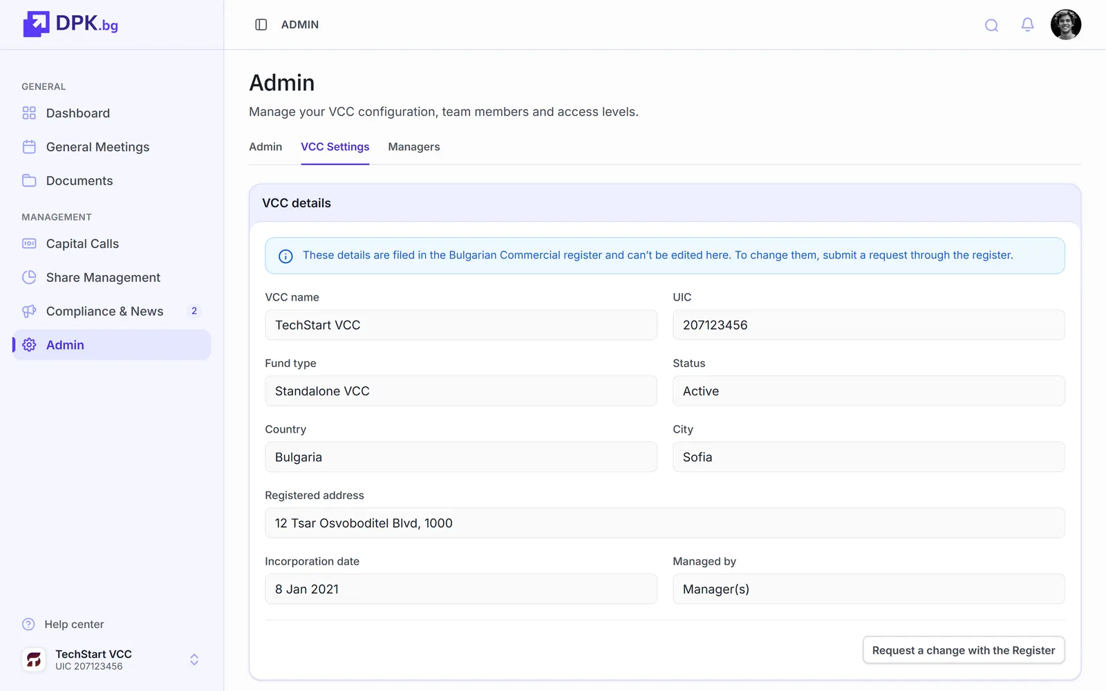
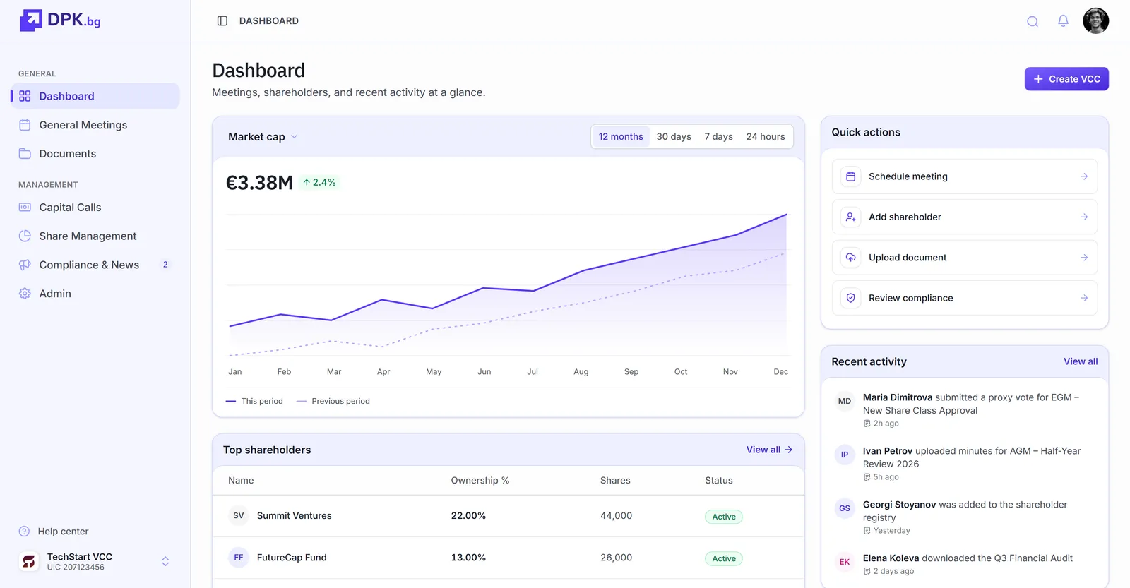
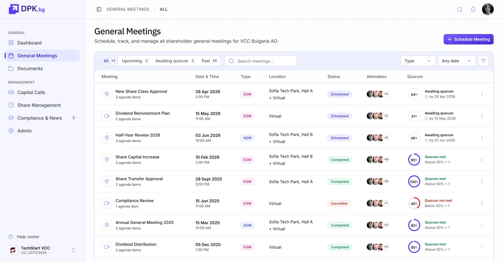
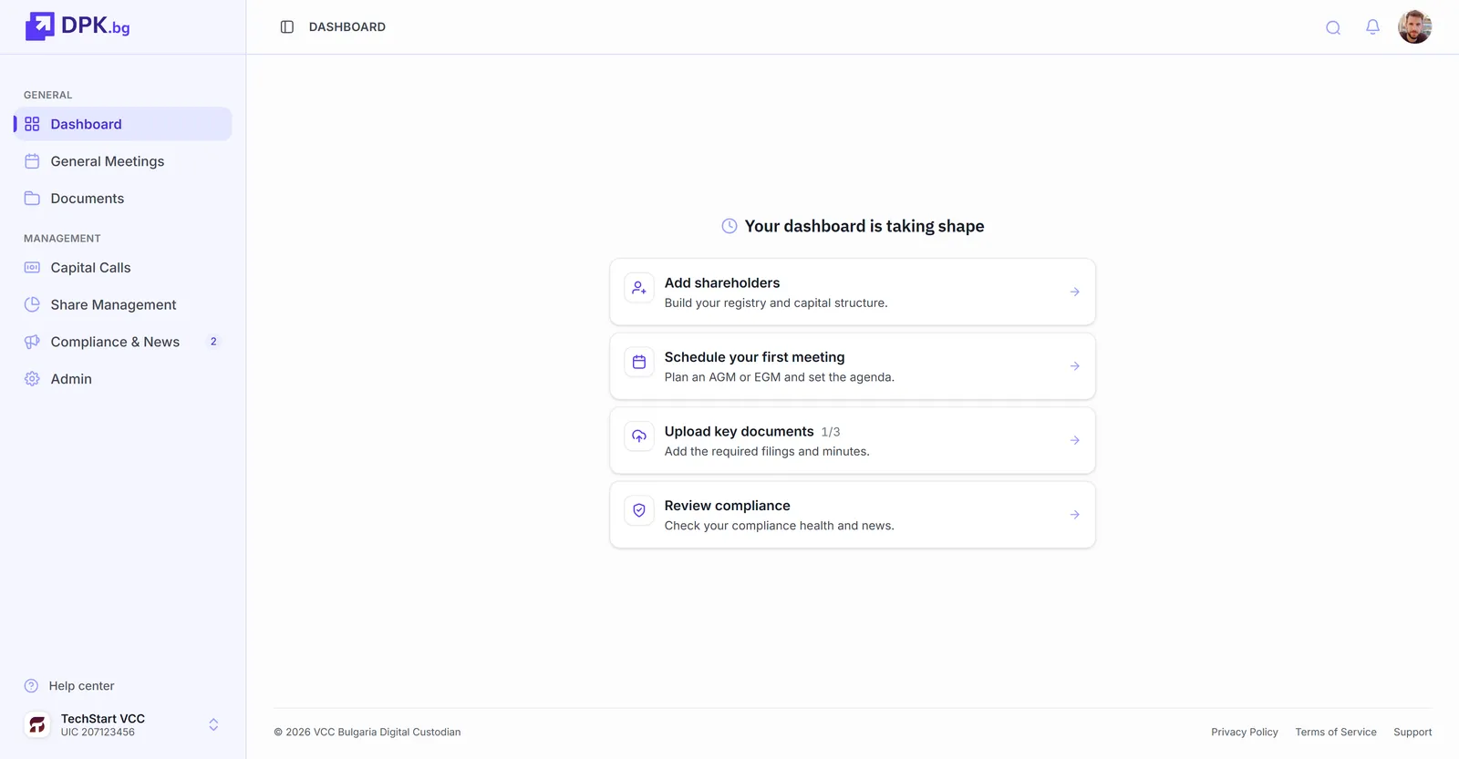
I stripped the marketing navigation out of the authenticated experience and rebuilt the sidebar as a single, clear navigation. Company switching moved into a dedicated control at the bottom of the sidebar, so the active company is always visible and easy to change.
Onboarding new users
A new user would register and land on... nothing. They were left to find their own way, which often meant they didn't log in again. The founders would end up contacting every new user personally to walk them through the platform. User. by. user.
It got worse: most of the sidebar was hidden if no VCC was connected to the account. Pages and menus that would normally exist simply weren't shown. New users saw only a fraction of the product and had no idea the rest existed.
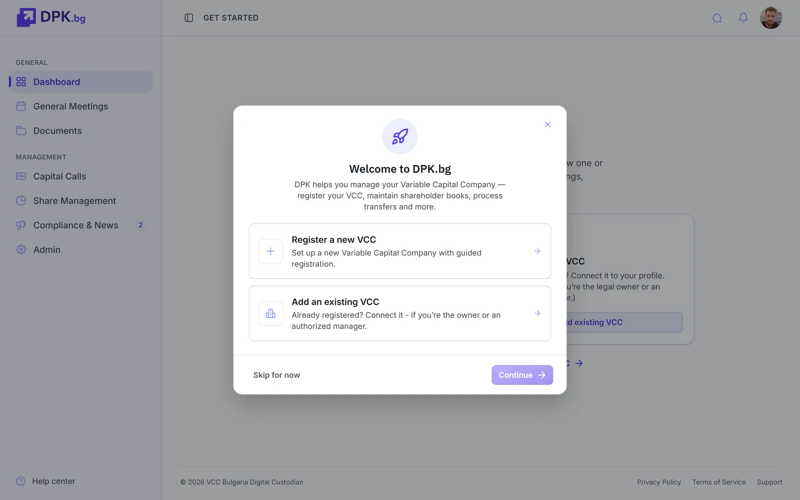
I redesigned the first-run experience. The sidebar now shows the full structure from the start, even before a VCC is connected. Each page renders with an empty state that explains what the page is for and how to use it, with a clear prompt for the first action that gets the user moving. There's also a demo mode that lets a new user explore the platform with sample data before committing to setup, so they can see what's there and decide what to do next.
Safer destructive actions
Delete and remove buttons were everywhere, bright and prominent, often pulling attention away from the actions the user actually came to do. They were also too easy to trigger by accident.
I moved destructive actions into a dedicated settings area, behind confirmation dialogs with explicit acknowledgment. On the main pages, the controls now visually recede so the primary actions can lead.
Delivered
The design work is complete. Engineering implementation is scheduled for Q3 to Q4.
What's been designed and approved: the new navigation, with marketing chrome removed and company switching centralised. The first-run experience for new users, including empty states, prompts, and a demo mode for exploration. Destructive actions moved behind confirmation and out of the primary action paths.