Publishing house rebranding
Overview
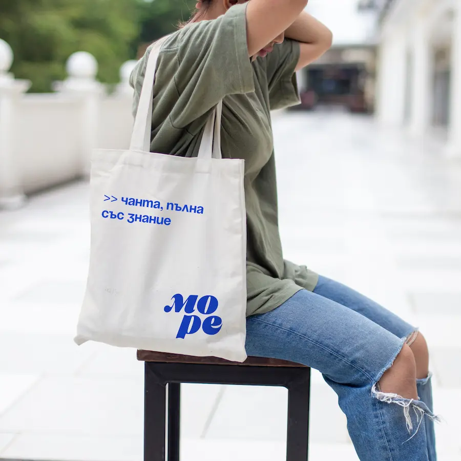
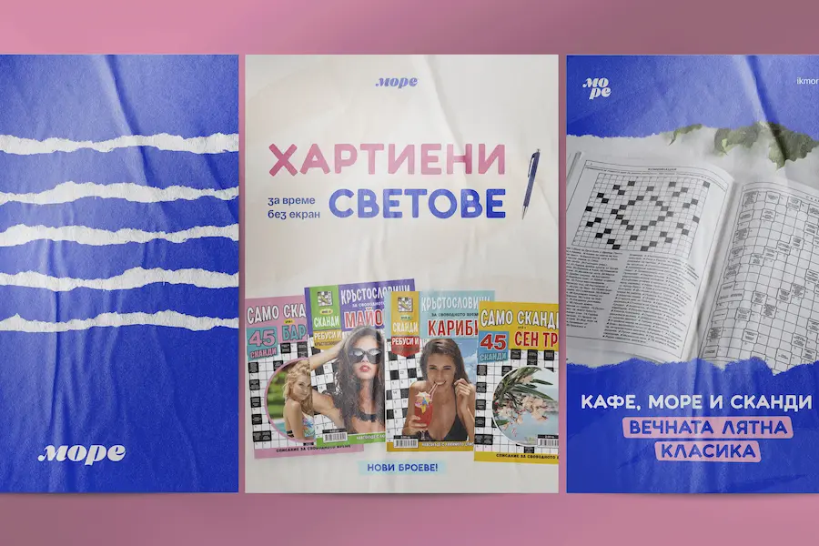
Led a complete rebrand of More publishing, from brand strategy and tone of voice to visual identity and print design. Modernized the brand, unified its presence across formats, and broadened appeal - from logic-loving adults to playful young readers.
The challenge
More (Море) is a Bulgarian publishing house with over 20 years of experience creating crosswords, logic puzzles, and educational books for children. Their name "More" means "sea," but their true spirit is about curiosity, challenge, and joyful learning.
Before the rebranding, the brand faced several consistency and identity issues:
- Multiple versions of the logo were being used across print and digital platforms, often with mismatched colors and styles
- Visuals leaned heavily on literal sea themes, feeling outdated and inflexible
- No clear system for differentiating between adult and children's editions
- Overall tone felt too corporate or serious - lacking the warmth and cleverness of the content itself
- Packaging and covers varied significantly, weakening brand recognition
Key decisions
Logo Redesign
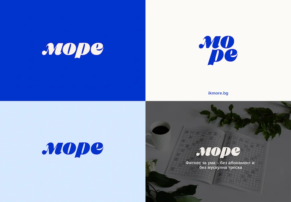
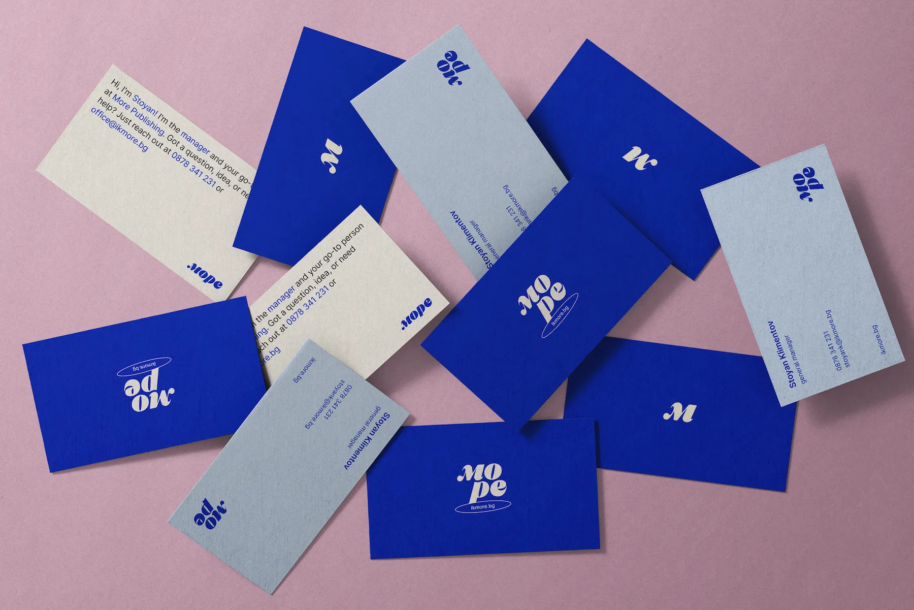
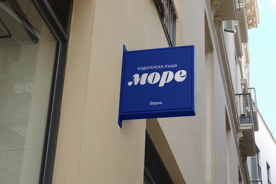
Created a geometric yet playful logo with a custom wordmark and flexible puzzle-inspired icon that works across all applications.
Color Palette
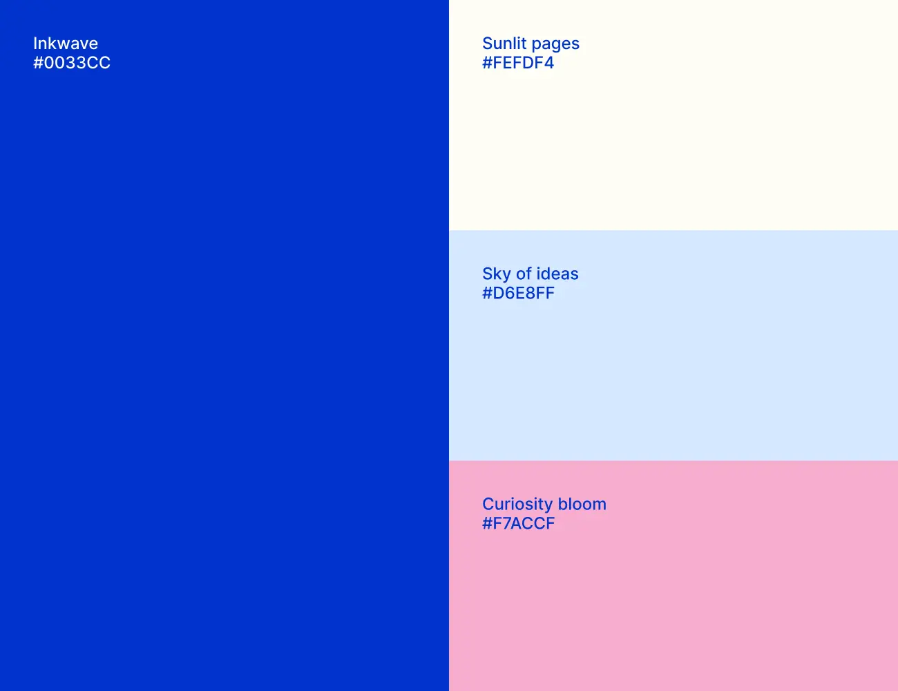
Developed colors that nod to the sea (deep blues, sun-washed sand) with warm pink accents for energy and approachability.
Typography
Selected clean sans-serif typefaces with just enough character - readable, modern, and multilingual.
Tone of Voice
Defined a clever, engaging, and warm voice suitable for packaging, ads, and social captions.
Layout & Product System
Built a clear, consistent design language adaptable across print and digital formats.
Results
Clear visual and verbal consistency across print and digital platforms. New partnerships forming monthly, attributed to clearer brand presentation and professional packaging.
- Stronger recognition from B2B partners (distributors, bookstores, educational institutions)
- Unified system allows the internal team to scale production efficiently
- Custom logo with multiple layout variations and a full identity system
- Print-ready design structure for multiple audience types